🧭1. Determining the visual direction
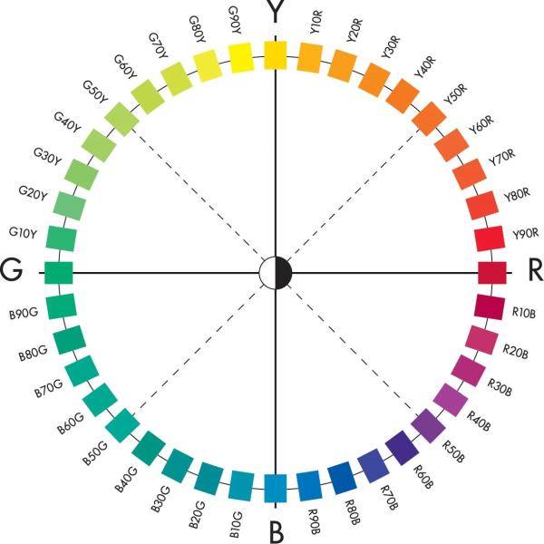
Choosing a colour starts with determining the visual direction: what hue should the colour radiate?
Professionals look at the position on the colour circle:
Examples of hues:
- •Y10R → soft warm yellow
- •R50B → purplish red
- •B30G → cool blue-green
- •G70Y → warm green towards yellow
🎨2. Varying within one colour area
Once the hue is chosen, you select variants within the same area.
With NCS you can within one hue:
- •choose light variants
- •choose dark variants
- •choose strong or muted variants
- •compose a series that is visually consistent
This step is essential for:
• interior concepts
• branding and identity
• material coordination
• product series
• project colours for facades, interiors or objects
☀️3. Choosing lightness (how light/dark should the colour be?)
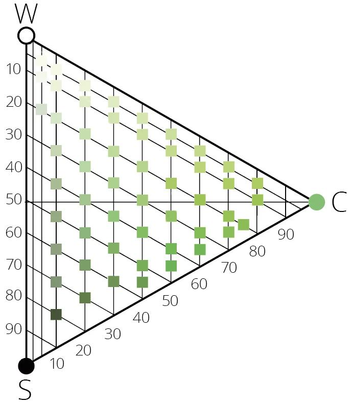
Within the same hue, multiple lightness levels exist.
You choose based on:
- •desired brightness
- •contrast effect
- •material reflection
- •function of the space or product
Lighter variants appear softer and more open; darker variants more powerful and heavier.
Example within one hue (fictitious examples):
light
S 0510-Y
medium
S 3030-Y
dark
S 7020-Y
You stay within the same direction, but choose the desired visual depth.
⚡4. Choosing saturation (strong or muted?)
In addition to lightness, you choose the visual saturation:
soft colours
calmer, subtler, friendlier
strong colours
more pronounced, more striking, more energetic
Professionals use saturation:
- •to set the atmosphere
- •to create accents
- •to create coherence
- •to find balance between calm and expressive areas
Example within one colour area:
muted
S 2020-R
stronger
S 4040-R
very intense
S 1060-R
The hue stays the same — the saturation changes.
⚪5. Working with neutral colours as a base
In colour selection, the N-series plays a supporting role.
Neutral colours are used to bring balance and structure to a palette.
They support the chromatic colours without dominating.
Examples within the N-series:
very light grey
S 0500-N
medium grey
S 3000-N
almost black
S 9000-N
Neutral colours:
- •connect colour accents with each other
- •provide calmness
- •enable contrast control
- •form the foundation of a professional colour palette
🎭6. Creating palettes and combinations
NCS makes it easy to create combinations that visually work.
Professionals choose combinations based on:
- •affinity within the same colour area
- •contrast between different colour areas
- •a range from light to dark
- •a range from soft to strong
- •a combination of chromatic and neutral colours
This creates a complete palette that works both aesthetically and functionally.
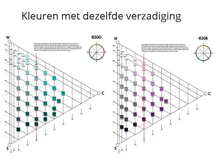
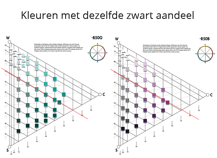
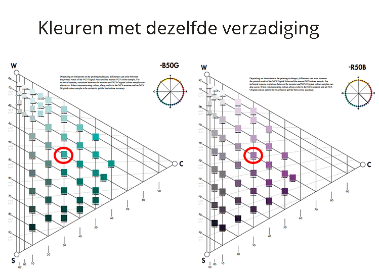
Examples of systematic combinations:
Same saturation
Same blackness
Same nuance
🔧7. Colour choice combined with material
The final colour choice depends on:
- •gloss level
- •material structure
- •lighting
- •scale and surface
- •context of the environment
⚠️ Method:
With NCS you first choose the visual colour image, then test the result on the material itself with physical samples or a colour fan.
Choose colours professionally with NCS?
Always use a current NCS colour fan or colour samples for reliable colour choices.
View all NCS colour fans and colour samples in our webshop from the Netherlands Colour Institute.
View NCS products →Want to learn more about colour selection with NCS?
Take the comprehensive Online NCS Colour Course from the Netherlands Colour Institute via the Kleurenschool.
View the online course →